SpaceKatt Logo
Year after year I found myself drawing the same abstract plant-creature in every notebook and margin. After a decade or so, this creature was used as the inspiration for the logo I plaster over my work.
Evolution of the SpaceKatt logo is expounded upon below!
Current Version
Here lies dragons the current version of the SpaceKatt logo:

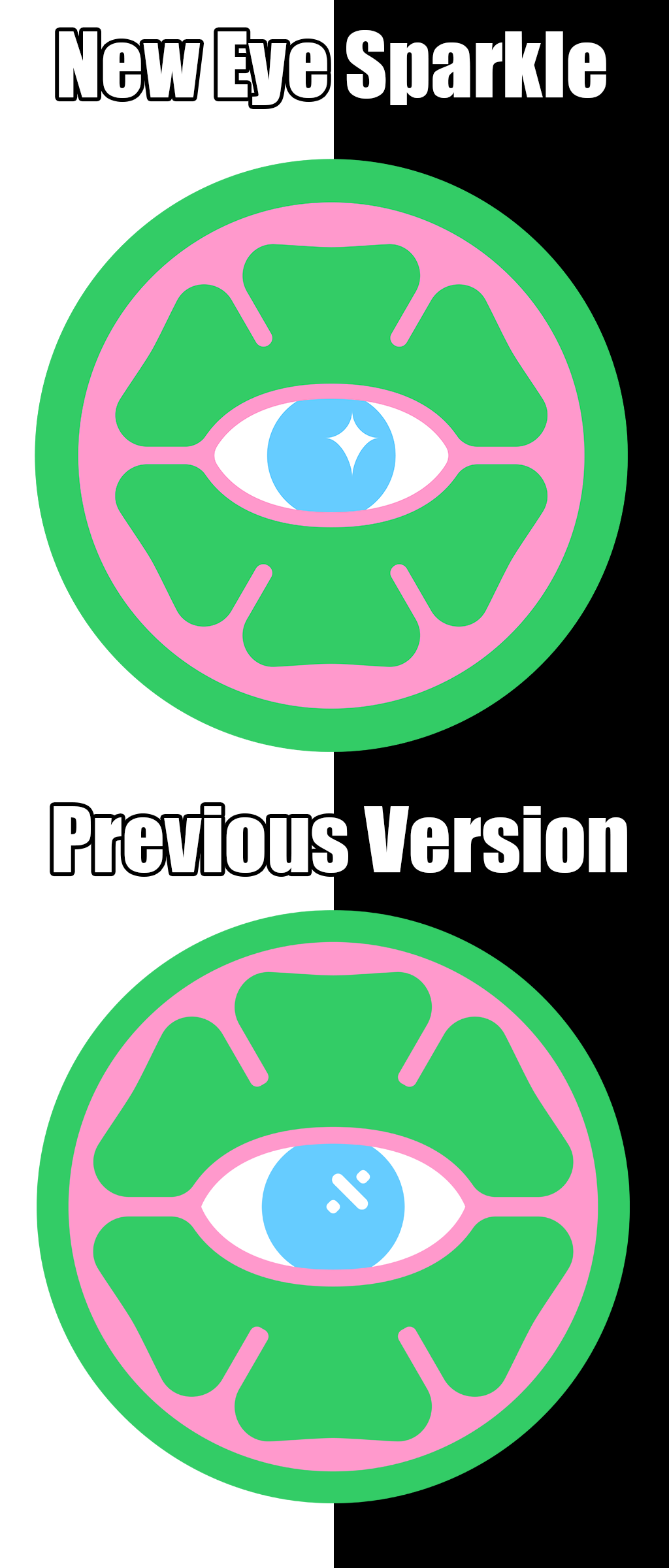
Pupil Change and Smooting Eye Corners (v4)
Many folk asked if the symbol in the eye of previous logo versions was the division operator. However, it was merely meant to be a reflection of light, one that I was never satisfied with. Now, the reflection is a "kawaii-like" sparkle!
Sharp corners in the eye were throwing off the whole vibe, so the corners were smoothed out in symmetry of their context.

v4 of the SpaceKatt logo in all of its glory:

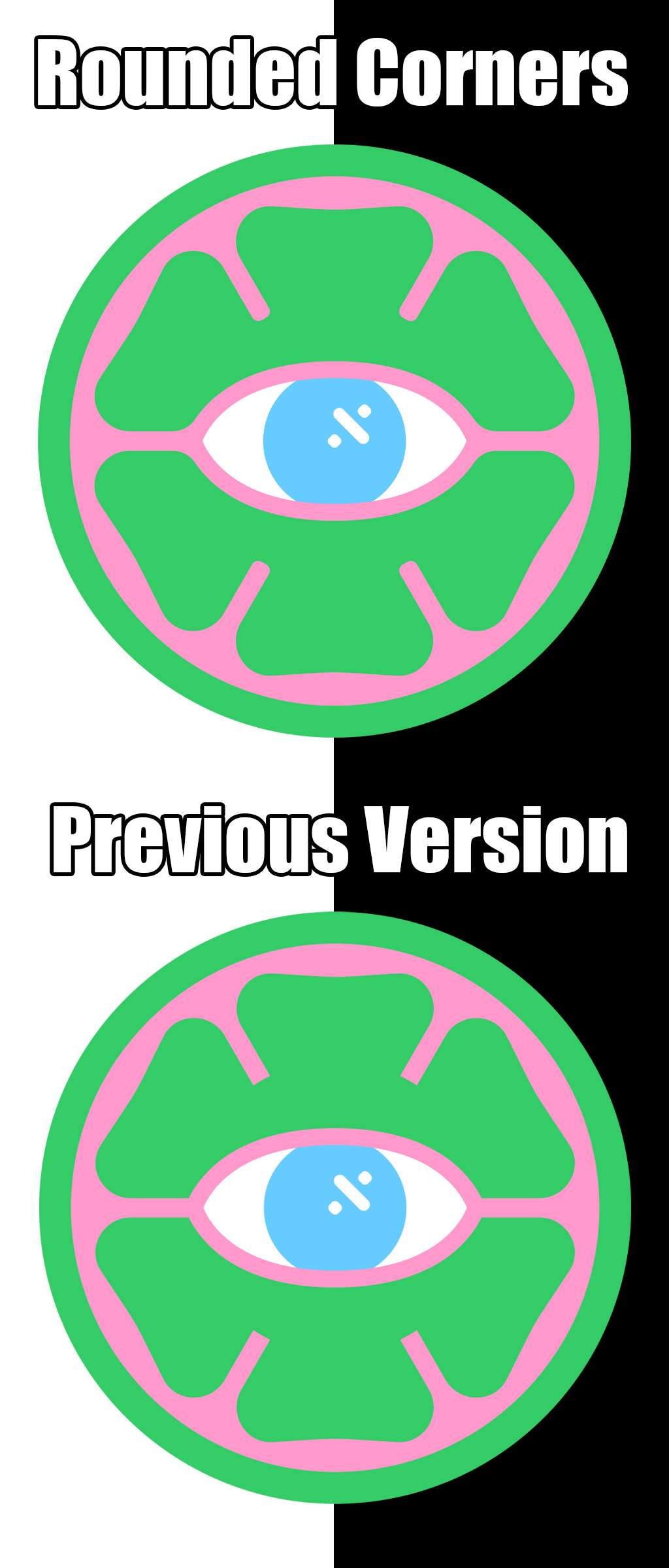
Rounding the Corners (v3)
Characters in children's shows often feature smooth corners. Human brains oft interpret sharp edges as dangerous and rounded corners as more calming. For this reason, corners were smoothed out in the new iteration of the logo.

v3 of the SpaceKatt logo in all of its glory:

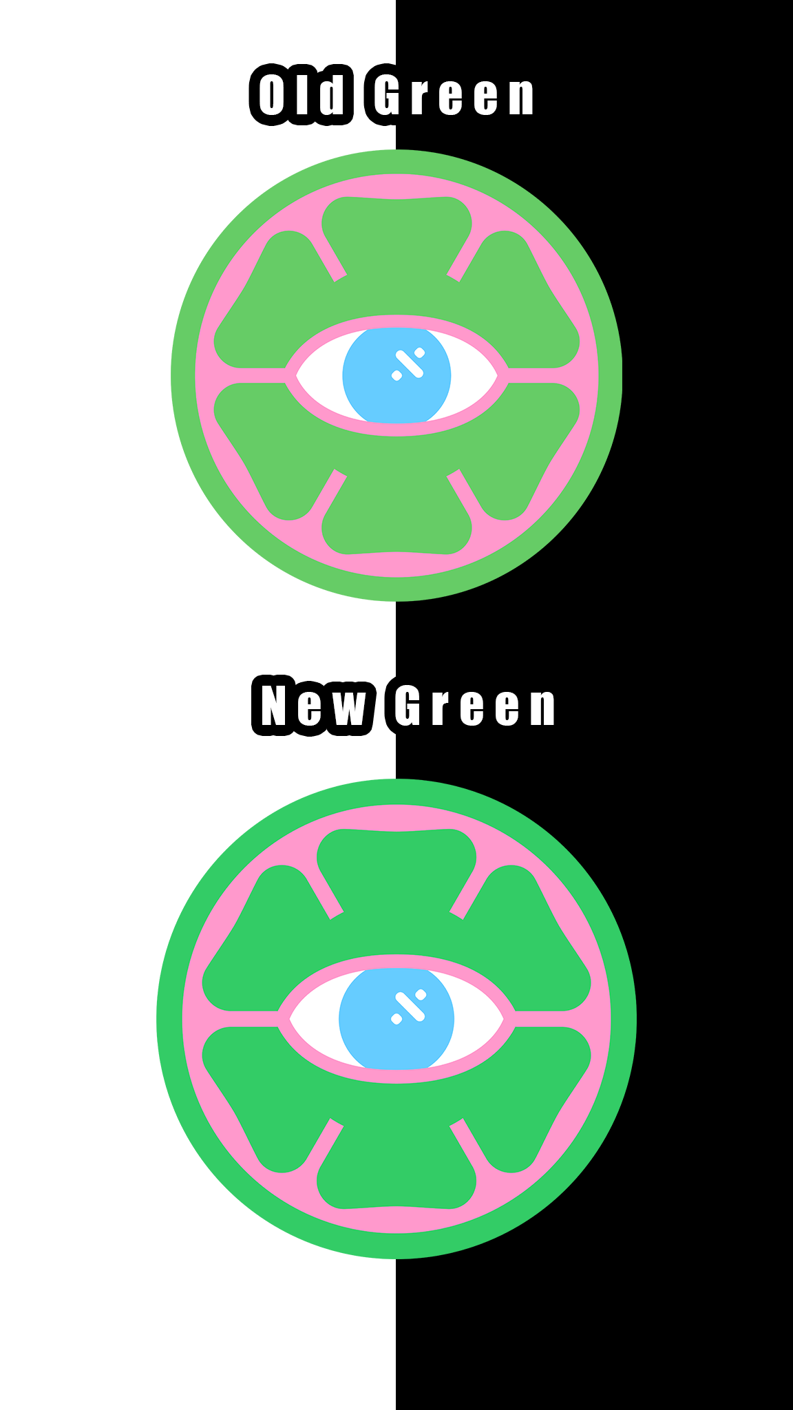
Updating the Green (v2)
Folk mentioned the pink and green colors in the first version were a little too "close" together, which caused a slight visual unpleasentness.
To remedy this issue, I decided to make the green color a little darker. It was a suble change that had a large impact on how folk preceived it!

v2 of the SpaceKatt logo in all of its glory:

First Version (v1)
The first version of the logo established the general color theme and various shapes constituent to the logo design.
The overall form factor is based upon a doodle I've been drawing since ~2008. Originally, the doodle had a more abstract shape which was normalized to a circle (in the interest of fitting on a button).
v1 of the SpaceKatt logo in all of its glory:
